Handling frontend for small devices with big screens
Date
24 APRIL 2024
In the recent years, phone makers have started to think how to improve the experience of using a smartphone by not just giving them a slight hardware or software update, but rather inventing new, or rather “newish” ways of interacting with content. Their solution was to make bigger screens for smartphones.
Beginnings
We said “newish” because there were devices in the past that were meant to combine the experiences of using a tablet and phone in one device, they were larger than most smartphones of today, but did not necessarily feature bigger screens then they do now, and they were called phablets. The reason they did not necessarily have bigger screens were large bezels, the technological limitation of that time.
Sure, there are still bezels on phones today, but they are practically minimal, and usually only contain either a selfie camera (if one is not already in a screen cutout), or some front-facing speakers. But back then, the bezels added a lot to the device’s dimensions, making them uncomftorable to put in your pocket, make calls, or everyday use.
New ideas, new trends
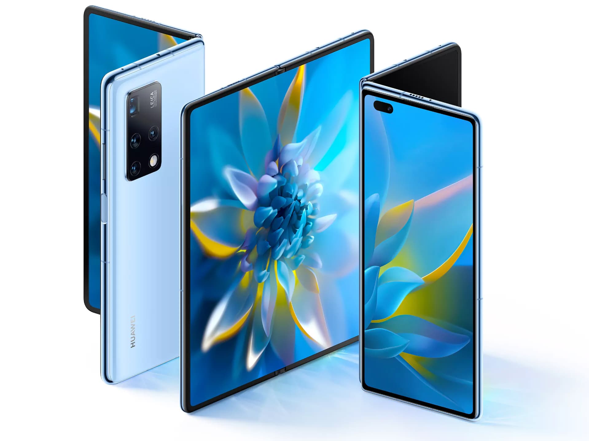
Nowadays, almost all new phones have a 85% or higher screen-to-body ratio, so to add more screen, they needed more body. In 2019, Samsung released the Galaxy Fold. The first foldable phone, that had a small 4.6 inch cover display, and when unfolded, a large 7.3 inch display.
What at first looked like a niche market, it is now filled with more viable entries than ever before from the likes of Google, OnePlus, and even Motorola, with screen sizes reaching up to 8 inches or more, which is quite a bit more than on standard phones of today. Which is where it gets potentially problematic for developers.
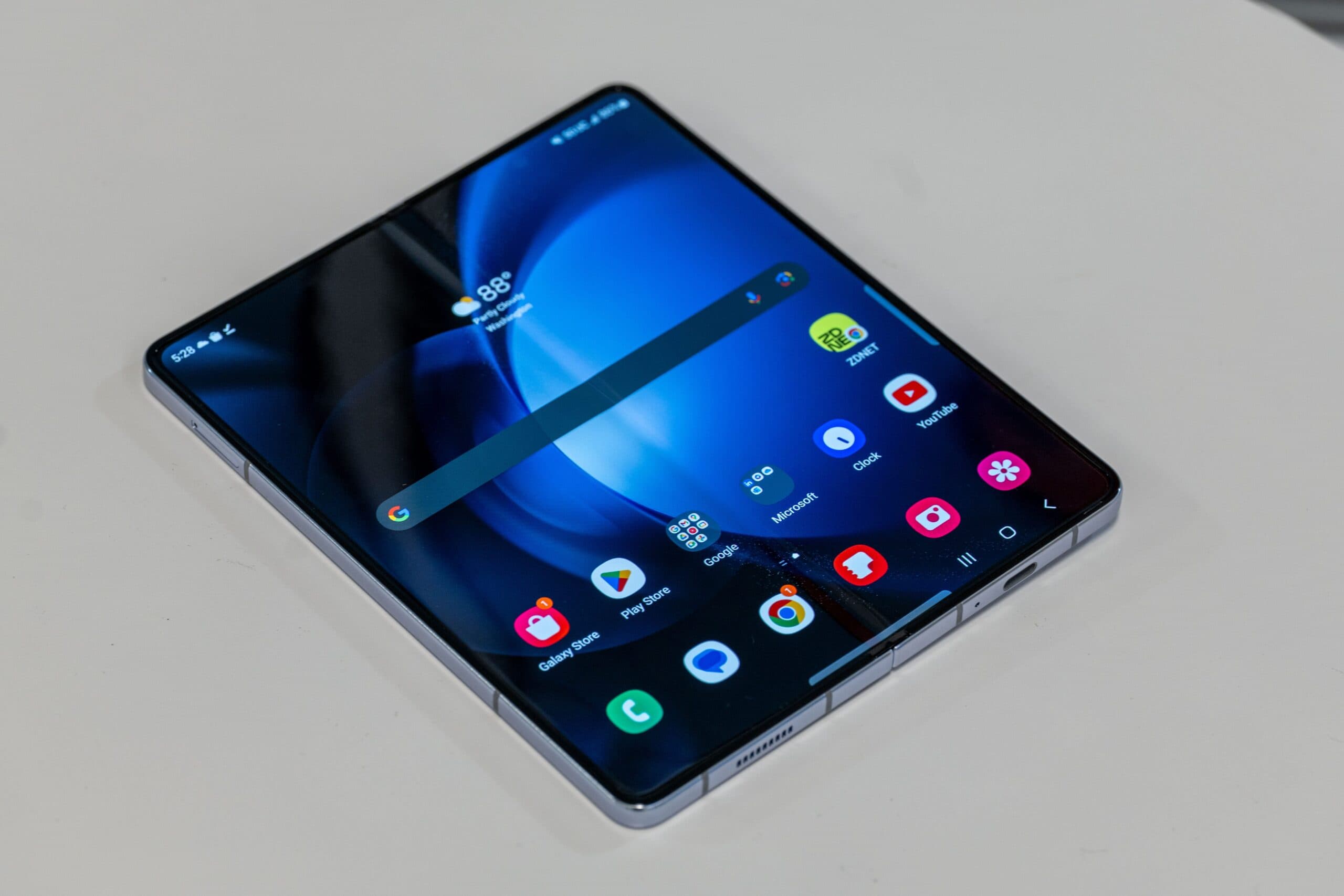
Suddenly, phones are now tablet sized, which forces frontend developers to account for better responsivnes for these screens, and not just for web browsing, some apps were also redesigned with foldables in mind. Usually, responsive web design was handled using css media queries, which simply made different CSS used on different screen sizes that matched the query, for example:
1
2
3
4
5
@media only screen and (max-width: 767px) {
  body {
    background-color: red;
  }
}
This would simply make the background color of the body element red if the screen width was 767px or less. 767px and 990px are a popular choice of breakpoints used for phones and tablets respectively, and foldables could sometimes be wider than even 990px, so you would be using CSS meant for desktop screens.
But there are other thing to consider, and it’s not just about the CSS, but also how the user interacts with a device. Desktop users have a cursor they control with a mouse or some other device, and they use it to click on links, scroll, interact with different elements like accordions or carousels, etc.
But with a phone, they don’t have a cursor, they use their fingers on the touchscreen to do all these things like clicking (touching!?) links, scrolling (swiping instead of draging the scrollbar or using a scroll wheel), pinching for zooming in and out.
Sometimes, some interactive elements like accordions or carousels might not work if they do not have proper 'touch' event listeners. Luckily, browsers typically dispatch emulated mouse and click events when there is only a single active touch point, however, multi-touch interactions involving two or more active touch points will usually only generate touch events. To prevent the emulated mouse events from being sent, use the preventDefault() method in the touch event handlers.
1
2
3
4
5
6
7
8
9
10
11
12
13
14
15
16
17
18
19
20
21
22
23
// Register touch event handlers
someElement.addEventListener("touchstart", process_touchstart, false);

// touchstart handler
function process_touchstart(ev) {
  // Set call preventDefault() to prevent emulating click events
  ev.preventDefault();
  // Use the event's data to call out to the appropriate gesture handlers
  switch (ev.touches.length) {
    case 1:
      handle_one_touch(ev);
      break;
    case 2:
      handle_two_touches(ev);
      break;
    case 3:
      handle_three_touches(ev);
      break;
    default:
      gesture_not_supported(ev);
      break;
  }
}
If you want to interact with both mouse and touches, use Pointer events instead.
But what if you have things like a custom cursor, one like this website has?
Device detection
CSS media queries and touch event listeners won’t solve all the problems when it comes to foldables, as for example: hiding a custom cursor on smaller screens won’t do the trick, because the screen is bigger when using the device unfolded, and it might exceed the breakpoint and be visible, only moving when you click/touch a link because of browser emulation, and accounting for all the possible touch events wouldn’t be easy, it would probably double the code needed for it to work properly, and would need additional changes for it’s behaviour.
Reliable device detection is necessary.
A popular practice was User Agent Sniffing which is not recommended today, and should be used only as a fallback. It involved using a long regex that would tell you if the user has a phone or desktop, but that wasn’t always reliable.
The best way, and recommended by MDN would be to use maxTouchPoints property of the Navigator interface, it is a read-only property that returns the maximum number of simultaneous touch contact points that are supported by the current device.
1
2
3
4
5
6
7
8
9
10
11
12
13
var hasTouchScreen = false;

if ("maxTouchPoints" in navigator) {
    hasTouchScreen = navigator.maxTouchPoints > 0;
}

if (hasTouchScreen) {
   // Device is likely mobile, so do stuff for mobile devices here.

   if (navigator.maxTouchPoints > 1) {
   // browser supports multi-touch
   }
}
With this, you can safely know if the input device has a touchscreen and if the browser supports multi-touch, and then make changes neccesary for better responsiveness and accessibility of your website.